Ryan MacInnes
@goddamnyouryan is a programmer, web developer and designer based all over the world.
Juicer started as a side project in 2014 but very quickly became a full time real company. Our customer base exploded over the next 4 years and we had to deal with a lot of customer service issues.
One of the most prevalent and annoying issues was dealing with customer invoices. Firstly, many of our customers were in the EU, and they needed custom invoices to be able to expense their costs to their business. Specifically they needed to have their companies VAT number on their invoice.
At Juicer we just used the built in Stripe receipts. This would automatically send our customers a simple receipt whenever their account got charged (usually monthly). The problem was, Stripe does not allow you to customize these receipts at all. So for all of our EU customers we would have to manually create an invoice for them every month that contained their business information. This was no problem at first, but quickly grew to the point that we were manually creating 10 or more invoices every day. While each one wasn't hard, they added up, not to mention all the calendar reminder logic we had to set up to make sure everyone got their invoice.
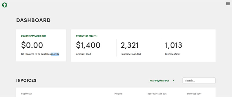
So I built a basic version of Payote, that simply allowed us to set up custom invoices on our Stripe customers, and would automatically email it to them when their payment went through.
The next problem with Stripe invoices was that users couldn't view their own invoices. If they lost one of their Stripe receipts there was no easy way for them to view their past invoices without contacting us, and having us re-email it to them. So the second phase of Payote was born; an embeddable invoice viewer.
This allowed customers to view all of their past invoices, change the billing email, and customize the data-field. We no longer had to deal with customer invoice issues, they could handle everything on their own, saving us and them time.
At the end of 2015 Rdio shut down. For those of you who don't know, Rdio was a online streaming service, a la Spotify or Apple Music. I was super bummed about it. Rdio was beautiful, easy to use and had the best recommendation features of all the streaming music services I had tried.
When it shut down I went on a bit of a rampage, trying all the other music streaming platforms. Spotify, Apple Music, Google Play, even Tidal. None of them worked in the way I wanted them too. They were all overly complicated, confusing, ugly, or in some cases, appallingly bad.
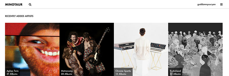
It wasn't until several months later, of dealing with super unsatisfying music playback, that I had the realization that I could create my own service. YouTube has basically all the music I ever listen to on it, the one downside is that it's not exactly built to be a music player. But combined with data from Spotify, I could mix those two together and create my own streaming service without having to deal with all the rights management that comes with licensing music. Minotaur was born.
I worked on Minotaur fiendishly for about a month, approaching an MVP and really happy with the direction it was taking (taking cues from the simplicity of Rdio). When I was around 90% done I came to the realization that there was no way for me to play music offline, or in an app form; since all the music comes from YouTube, there was no way to download those tracks to your phone, nor is there a way to play YouTube videos in the background on your phone. Between that and Juicer getting busier, I gave up. The project sat at 90% complete for 2 years.
Then in early 2018 I revisited it. I still wasn't satisfied with any of the streaming music services out there (though I had become begrudgingly accustomed to Spotify) and I found myself often thinking about Minotaur. I decided that I wouldn't worry too much about the mobile aspects of Minotaur, 99% of the time I was listening to music it was while I was on my laptop with an internet connection anyways. I gritted my teeth and decided to get Minotaur to an MVP level at least.
There's still a lot of work to be done to get it to the level of Rdio, but for an MVP it still works shockingly well! I'm using it as my main day to day music player.
Juicer is a personal project of mine. It came about not because I am passionate about social media feeds (or social media marketing in general) but rather because I saw a space in the market for it, and I was going to have to basically build it anyways.
Over the course of two years I had three separate clients ask me to put a "social media feed" on to their sites. For those who don't know what that is, it's basically all of their posts from their various business-related social media posts in a single location. Doing this manually would obviously be a huge pain in the ass (you'd have to update the website every time you tweet.
When my first client asked me to do this, I immediately googled Social Media Feed.
I found a service called Tint. Tint was great, it did exactly what I wanted it to do, you'd enter in your social media account names, copy and paste some code on to your site and voila you had a social media feed on your site. Best of all Tint cost $10 a month.
Tint did all the heavy lifting for you, it connected to the social media sites (which can be a surprising pain in the ass, and each one is different), and automatically pulled in the new posts for you, so once you embedded it you didn't have to do anything after that.
I happily used Tint for several clients sites until I was building the site for Descendants and they asked me to add a social media feed. I went to go sign them up to Tint when I discovered that Tint had raised their prices from $10 a month to $250 a month (since then they have raised their prices again to $500 a month).
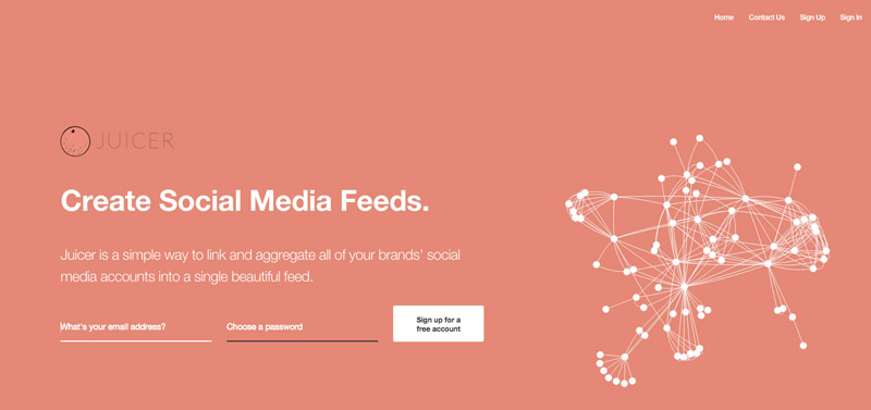
 Descendants obviously didn't want to pay $250 a month but they still wanted a social media feed on their site. They asked if I would build a custom one for them. I said I would just build a tint-like service and not charge them for it (on the condition they sign up for the service). I called it Juicer.
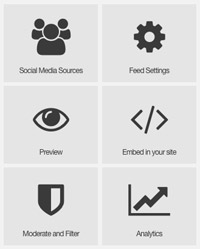
It works almost exactly the same way Tint does, you enter your social media account names and copy and paste some code on to your site and Juicer does the rest.
But if you ask me, it's better than Tint.
In addition to automatically syncing your social media accounts with your embedded feed, here's why I think Juicer is better than Tint (and all other competitors, for that matter)
- Cheaper! (there's even a free plan)
- More Social Media Accounts
- Prettier! (Juicer is probably the most beautiful thing I've ever designed.)
- Moderation, Filtering, Analytics
 Juicer is also probably one of the best looking sites I've ever designed. It's built in Ruby on Rails, responsive and all that. I manually pull in the posts from 15 different social media sites using libraries I built myself. I handle payment processing with Stripe. I also spent a long time on SEO.
Tint is crazy expensive for what they offer, and I don't think that's okay. There are tons of people out there who would like to have a social media feed on their site but definitely cannot afford $500 a month (hell, you can get a decent apartment in the midwest for that much). Juicer is for them.
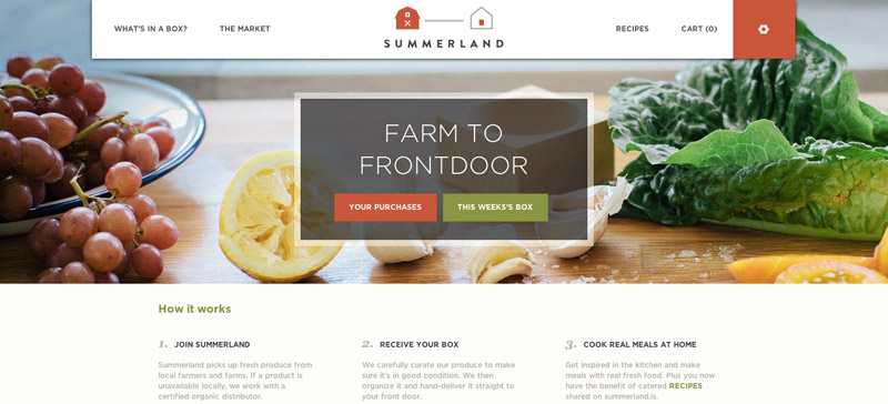
Summerland is a subscription based food delivery service. Essentially you sign up and every week you get a box of vegetables and fruit delivered straight to your door. It's kind of like a CSA box, but you can personalize it, and you don't have to go pick it up yourself.
Summerland was an interesting project for many reasons. From the consumer facing side, it's your fairly basic e-commerce website. Add some products to your account, and pay!
There's some twists on that, from a programming perspective. First of all, customers don't just sign up for a one time delivery, they get a box every week (or two weeks, or monthly, or just once!) The logic involved to make sure that everyone get's their delivery when they are supposed to is much more complex than your average e-commerce site.
Secondly, every box is different. It's a farm to front-door style solution, that means whatever the farms are currently offering as a crop is what comes in your box. So of course there has to be a much more complex inventory system on the backend to handle the weekly variances in product.
Thirdly, Summerland is local to Los Angeles, and they handle deliveries in house. So the backend also contains a driver routing application that allows Summerland's owners to get the most efficient route for the drivers each day. No two days deliveries are ever the same, and a variable number of drivers are working on a given day, so as you might imagine this was also very difficult to program but it resulted in saving the company a whole lot of time and effort.
Overall a huge amount of effort went in to building a robust and helpful admin section for Summerland. I couldn't have done it without my friend and UI/UX expert Doris Yee.
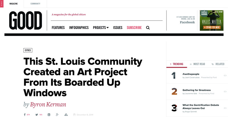
I worked at GOOD for two years as a Software Engineer.
During my tenure we transformed the site from an online magazine into a "Social Network for Social Good". It has since reverted back into an online magazine, for the most part.
I left GOOD in December 2013 to travel around Asia for 5 months. You can read all about my travels on my Blog.
We had an amazing product team at GOOD. It's where I learned how to really scale a Rails site for high traffic. I learned to love backbone.js. I learned that code doesn't have to just be functional, it can be beautiful as well. I learned that it's possible to be friend-friends with your co-workers, not just work-friends.
I also met my girlfriend Allison there, so that's cool too.
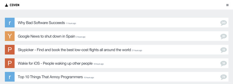
Coven is a simple web app and a Google Chrome Extension that turns your new tab screen into a list of all that days programming related news.
I came across an extension called Panda that was for designers, it had design related news and inspiration.
I loved the idea of Panda but I wanted to change a few things. First, I wanted the news to be targeted towards developers, not designers. Secondly, I wanted to be able to see all the news from the various sources in one place (with Panda you can only show one source at a single time). Thirdly I wanted to do away with the inspiration section. Us developers don't need inspiration.
So I built Coven over the course of a week or so. It was my first Chrome Extension, which was interesting. I also built it in two parts, a Rails backed API Service that polls the news sources and pulls in new articles and a front-end built using Middleman, a static site generator.
I've also opened sourced both parts the API and the Front End.
It's certainly not the prettiest thing I've ever built but it gets the job done. I use the Chrome Extension every day.
Tomorrow Magazine was put together by a bunch of my former co-workers at GOOD as a one off magazine funded through Kickstarter.
Together with my designer friend Renee Solorzano we designed and built the site in two weeks.
Compared to a lot of my other work it's pretty straightforwards from a programming perspective, it's basically an online magazine. It's mostly impressive because a) We did the whole thing in two weeks and b) It's fucking gorgeous. Of course, I had little to do with that, it's almost entirely due to Renee that it's so beautiful.
Over the years I have built almost countless sites for Production Companies (don't ask me why, it just happened). Sons and Daughters was the first, and my personal favorite.
When I originally quoted them I was planning on building the site in Rails. Right as I was just about to start building their IT guy got in contact with me to let me know that they needed the site done in PHP so they could host it on their servers. This was back in 2008 or so when I didn't know any better, so I agreed, despite not being especially good at PHP (I never bothered to get really good because I didn't like it and rarely used it outside of Wordpress).
I ended up building them an entire CMS from scratch in PHP so they could add videos and directors without my input. Unfortunately the IT guy insisted on hosting everything, including the video files on their servers, so it's not as it would have been if I had used Amazon CloudFront as a CDN.
So technology-wise it's nothing exciting and not playing to my strengths, but I'm still incredibly happy with how the design and everything else turned out.
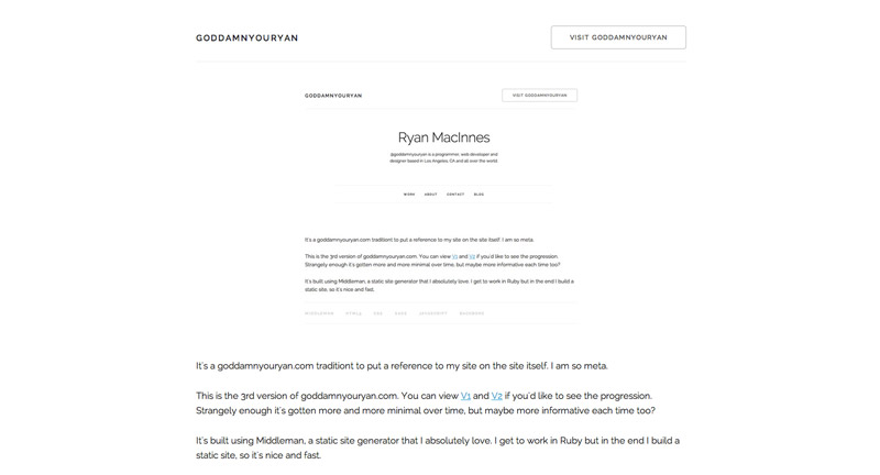
It's a goddamnyouryan.com tradition to put a reference to my site on the site itself. I am so meta.
This is the 3rd version of goddamnyouryan.com. You can view V1 and V2 if you'd like to see the progression. Strangely enough it's gotten more and more minimal over time, but maybe more informative each time too?
It's built using Middleman, a static site generator that I absolutely love. I get to work in Ruby but in the end I build a static site, so it's nice and fast.
1985
Ryan Born
1988
Uses his first computer
I somehow learned to navigate through DOS on my dads 30lb laptop so I could play Reader Rabbit.
1992
Asks Mom what Internet is
She had clearly read about it in the newspaper but still didn't fully understand it. "It's like a place where people can post on bulletin boards from all across the world".
1996
Checks out book on C++ from library
It definitely wasn't "C++ for Beginners". I read the first chapter and didn't understand it. Promptly returned.
1997
Makes first website
Might as well have been a geocities page. I believe it had a MIDI song that played in the background.
2001
Takes "Web Design 1 and 2"
Honestly I'm kind of shocked my High School offered these courses. It's where I learned HTML, CSS, Flash (hah) and Photoshop. I fell in love.
2003
Graduates Highschool / Attends College
I was either going to study Computer Science or Biology. I chose Biology.
2003
Makes guide-to-life.com with Freshman roommate
We achieved a moderate amount of success, at least as far as humor websites in the early 2000's go.
2006
Comes up with first app idea
I initially described it as a mix between Facebook and Wikipedia. I had no idea how to build it at the time.
2007
Graduates College
I attended Michigan State University and got degrees in Microbiology and Environmental Biology. Obviously I'm putting them to good use.
2008
Moves to Los Angeles
Mostly because it was warm all year round, and wasn't Michigan.
2008
Builds First App
I taught myself Ruby on Rails from a series of books. The end result was HEARSAY. It did okay, though it's no longer online.
2008
Starts Freelancing
People saw my first app and liked it. They offered to pay me to build more web apps. I obliged.
2009
Starts work at Sony Pictures
Making websites for movies.
2012
Starts work at GOOD
My first job at a company where the site I was working on was the Product. Loved it.
2012
Moves to New York City
Thankfully GOOD let me work remotely from NYC. I spent a lot of time in my apartment.
2013
Travels Asia
I quit GOOD so that I could spend 5 months going around Asia. Read about it on my blog. I've been self-employed ever since.
2014
Returns to Los Angeles
It's much cheaper than NYC, considering I am self-employed. And much warmer.
2014
Makes this Website
2015
Attends Y Combinator
YC Summer 2015. Lives in Palo Alto for 3 months.
2016
Gives talk in Taiwan
For Rails Pacific. About starting your own business. Embarassingly enough, it's watchable on YouTube.
2017
Moves to Tokyo
Spent a year studing Japanese.
2018
Sells Juicer
To a Germany based team called SaaS.group. I also wrote about it.
